I designed the Anti Up box logo by combining a variety of original brand assets. The Anti Up word mark, club-crown icon, community hotline, and brand tagline are formatted within the box logo that is found in all of Anti Up’s EP artworks.
I designed content for Anti Up’s Instagram feed by repurposing existing video footage, BTS studio shots, and reimagined box logos. I introduced concepts like closed captions and yellow architecture to increase brand recognition and consistency in the feed.
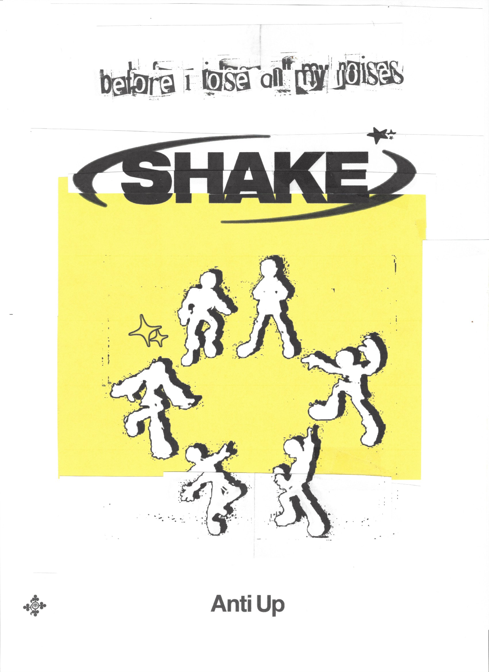
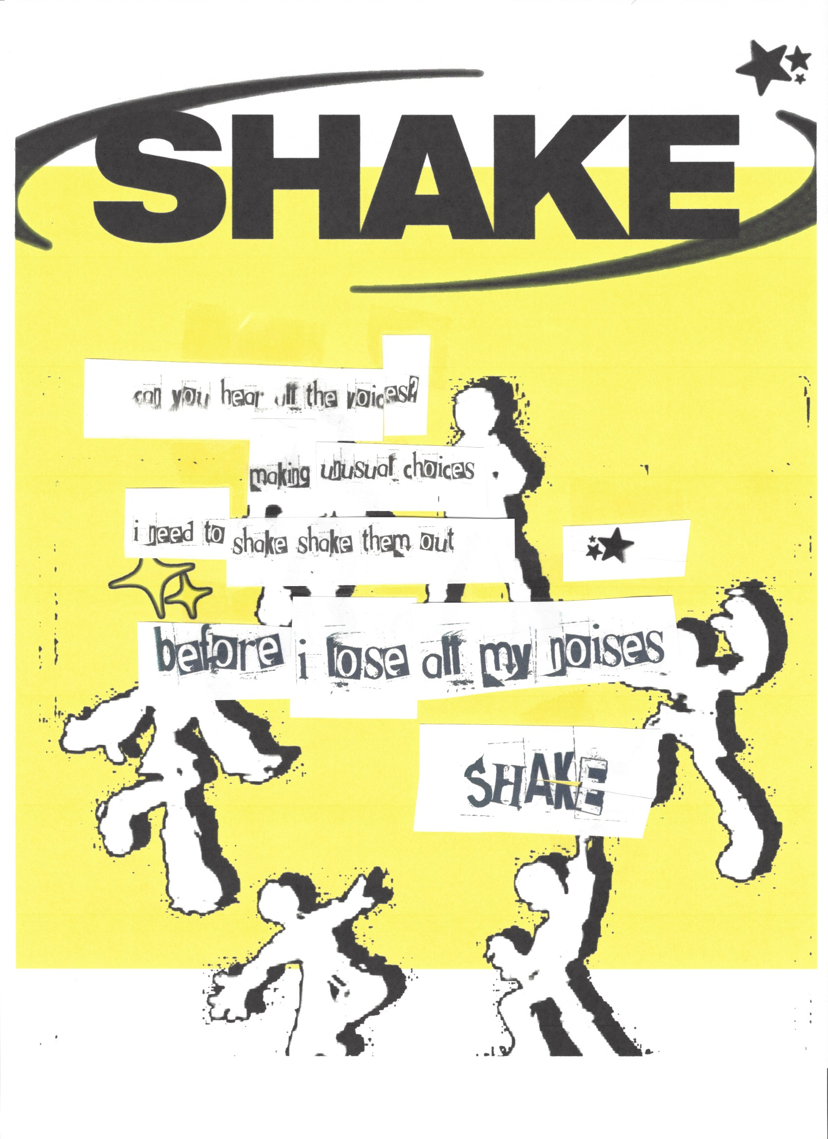
“Shake” Event Poster & “Shake” Lyric Poster
I designed these posters in a multi-step process utilizing both digital and physical techniques. I started with a variety of graphic designs that I printed, cut, layered, formatted, and eventually scanned back to digital.
Chris Lake was tired of posting boring performance photos and requested a new direction. At this time, Anti Up’s social media manager was posting 3 photos at a time. I proposed this dynamic collage style, alternating B&W with negative space yellow. My process here was simple. In Photoshop, I masked the artists individually then composed them on top of equipment, stage shots, or flat yellow. Lastly, I would add some grain and tweak the levels to bring focus to the foreground.


These “Shake” EP Artwork options utilized the classic Anti Up box logo overlayed on a variety of still frames from animations produced in After Effects. The title “Shake” was handwritten on my iPad in Procreate.


